Enhanced Dark Mode With Higher Contrast
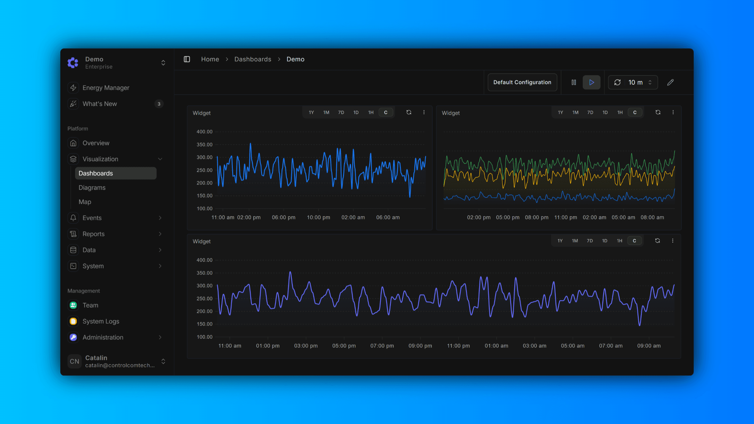
We've given Dark Mode a fresh new look. Based on user feedback, we've moved away from our previous muted color palette to a higher-contrast theme designed for improved legibility and reduced eye strain. Whether you're looking at dashboards late into the evening or working in low-light environments, the updated Dark Mode delivers sharper text, clearer UI elements, and a more refined visual experience—without sacrificing the sleek aesthetic you expect from ControlCom Connect.
True Neutral Tones for Seamless Branding
We've also eliminated the blue shift that was present in our previous dark theme. The new color palette uses true neutral tones, ensuring your brand colors, charts, and data visualizations render accurately without unwanted color distortion. Your dashboards now look exactly as intended—letting your branding take center stage.