Tools Updates
12 updates in this category.
June 30, 2026
Diagrams light & dark mode
Hierarchical HMI and Diagrams
Building complex visual interfaces for water/wastewater or manufacturing sites is faster with new reusable structures and logic tools in the HMI editor.
Nested Diagram Instances: Create reusable diagram components and nest them within larger views to build hierarchical monitoring structures.
Local Variables: Use local variables within diagram instances to create more dynamic and responsive visual elements.
Visual Enhancements: Add pulse animations, drop shadows, and arrowheads to lines to improve clarity for operators.
Global Color Replacement: Quickly update the visual style of an entire diagram by replacing specific colors or dark mode variants in one step.
Dashboard and Workflow Updates
New widgets and navigation tools help you access critical data with fewer clicks.
Asset Table Widget: Add asset tables directly to your dashboards to view and interact with equipment data in a consolidated view.
Sidebar Shortcuts: Pin your most frequently used features to the sidebar for immediate access.
Diagram Dark Mode: High-contrast dark mode support is now available for diagrams to reduce eye strain in control room environments.
Location Hierarchy: Visualize your facility structure with an improved tree view for better organization of distributed assets.
June 15, 2026
Global Search & New Reports
Finding the data you need and managing large-scale equipment fleets is now much faster in ControlCom Connect. This update introduces platform-wide search, deeper asset reporting, and expanded hardware support for industrial monitoring.
Global Search and Centralized Navigation
A new global search bar allows you to find devices, assets, and configuration settings from anywhere in the platform. This means less time clicking through menus and faster access to critical monitoring data.
- Consolidated Settings: Access billing, organization details, and API keys in one unified section.
- Onboarding Tracking: New users can now track their setup progress to ensure every gateway and sensor is configured correctly.
- User Management: Manage pending invitations in a dedicated view and cancel multiple pending invites at once to clean up your team roster.
Asset Intelligence and Scheduled Reports
Managing complex hierarchies in manufacturing or water/wastewater facilities is simpler with updated asset tools designed for plant managers and integrators.
- Bulk Asset Creation: Add multiple pieces of equipment at once rather than configuring them individually, saving time during site commissioning.
- Scheduled Email Reports: Set up asset reports to run automatically on an hourly or daily basis using custom CRON expressions. You can receive these as CSV files directly in your inbox.
- Flexible Relationships: Define how equipment interacts and manage asset types more effectively to build an accurate digital twin of your facility.
Expanded Device Support
Connecting field hardware is now easier with native support for more industrial devices and protocols.
- Milesight Integration: The platform now includes native support for Milesight FT101 and WT201-v2 devices.
- Gateway Management: You can now manage LoRaWAN gateway certificates directly when configuring devices, simplifying the secure connection of edge hardware.
Precision Alarm Management
Keep your response teams focused with better context and timing for alerts to reduce downtime.
- Alarm Breakdown Panel: Use the new breakdown panel in your alarm history for a deeper analysis of why and when alerts are triggered.
- Notification Delays: Configure a specific delay for alarm notifications to manage when alerts are sent, helping to filter out momentary data spikes.
June 4, 2026
Enhanced Alarm Management
This update to ControlCom Connect introduces advanced workflows for managing industrial alerts and more ways to share your data. Plant managers and integrators can now coordinate faster response times through dedicated alarm assignments and real-time interface updates.
Streamlined Alarm Response
Responding to critical events in water/wastewater or manufacturing environments is now more collaborative. These new tools ensure that every alarm is tracked from the moment it triggers until it is resolved.
- Assign and Acknowledge: Now you can assign specific alarms to team members and acknowledge them directly within the platform. This makes it clear who is handling a situation.
- Alarm Troubleshooting Page: A new dedicated view provides context for every event, including timelines and correlation visualizations to help you find the root cause faster.
- Email Notifications: Stay informed immediately when an alarm is assigned to you, reducing response time for critical equipment failures.
- Notes and Context: Add notes to alarms to document troubleshooting steps or provide site-specific context for other operators.
Data Portability and Exports
Moving data out of ControlCom Connect for reporting or secondary analysis is now a simple, one-click process. This is built for facilities that require external documentation for compliance or deeper analytics.
- CSV Timeseries Export: Download raw device data directly into a CSV format for use in spreadsheet software or external databases.
- PNG Chart Export: Save any ECharts visualization as a high-resolution PNG image for inclusion in status reports or maintenance logs.
Real-Time UI and Diagram History
The platform now feels more responsive and provides better protection for your engineering work. Real-time data updates now appear in the UI without requiring a page refresh, keeping your view of the plant floor current.
Version Control for Designs
To protect your configuration work, dashboards and diagrams now maintain a history of the last 20 saves. This allows you to revert changes if a configuration error occurs during site commissioning.
Visual Context in Diagrams
You can now embed images directly into your diagrams. This allows for more realistic HMI screens by including facility photos, equipment schematics, or site maps as a backdrop for your live data points.
May 14, 2026
Device Templates for Faster Fleet Management
Managing a large fleet of field sensors just got simpler. We have overhauled how device data is organized within ControlCom Connect, making it easier for integrators to scale their monitoring systems while maintaining data integrity across the platform.
Structured Device Templates
Organizing variables and commands is now more intuitive with a new device template structure. This update allows you to define the behavior and data points of your hardware in a centralized way, ensuring consistency across all installations.
Organized Variables: Group and define sensor data more clearly within each template.
Command Definitions: Standardize the instructions sent to your hardware, making it easier to control multiple devices of the same type.
Faster Deployment: Once a template is created, you can apply it to new devices instantly, reducing the time spent on manual configuration during site setups.
Template and Gateway Integration
To help plant managers maintain a clear view of their network hierarchy, device templates now link directly to ControlCom gateways. This means you can manage all connected hardware through the specific gateway that handles its traffic, providing better visibility into your field architecture and simplifying remote monitoring tasks.
Improved Data Ingestion Reliability
We have updated the core data processing engine to ensure your industrial data flows more reliably from the edge to the dashboard. These changes mean less latency and fewer missed data points, which is critical for accurate predictive analytics and real-time alarming in water/wastewater and manufacturing environments.
What This Means for You
Fewer Truck Rolls: Better organization and reliable data mean you can troubleshoot more from the office.
Simpler Scaling: Adding ten or one hundred new sensors follows the same structured workflow.
Clearer Insights: With standardized templates, your data is more consistent, making it easier to compare performance across different sites or assets.
May 6, 2026
Device Diagnostics and Security Enhancements
Managing your industrial hardware and facility data is now more transparent. This update to ControlCom Connect brings better diagnostic tools for field devices, enhanced security for large teams, and smarter ways to anticipate system changes through predictive graphing.
Deep Diagnostics for Faster Troubleshooting
Understanding why a device is offline or behaving unexpectedly is now simpler. We have added tools to the Device Details page that provide immediate context for field technicians and plant managers.
Activity Timeline: Track device events over time to see exactly when a status changed.
Troubleshooting Messages: Access a log of device messages from the last 24 hours to identify communication errors quickly.
Health Metrics: View real-time connection status and health indicators directly on the device dashboard.
Live Namespace Values: See variables update in real-time within the interface, ensuring you are looking at current field data.
Enhanced Security and Access Management
As your operations scale, managing who can see and edit specific data becomes critical. ControlCom Connect now supports more granular security protocols and centralized authentication.
Custom User Roles: Assign specific roles to users to control access to features and data sets within the platform.
Login Awareness: New security alerts now include the geographical location of login attempts, helping you identify unauthorized access.
Smarter AI and Predictive Insights
We are making the ControlCom Connect AI Assistant more effective by allowing it to understand the specific context of your industry and facility.
Domain-Specific AI Knowledge
You can now define domain knowledge rules that the AI Assistant uses to provide more accurate answers tailored to your specific facility type, whether it’s water/wastewater, manufacturing, or healthcare.
Trend Predictions on Graphs
Graphs now support trend predictions. This means you can see where your data is heading based on historical patterns, allowing for proactive adjustments before thresholds are reached and alarms are triggered.
Expanded Protocol and Device Support
Connecting a wider variety of hardware is now easier with improved support for popular industrial protocols and bulk configuration tools.
LoRaWAN Management: Connect and manage LoRaWAN devices and gateways directly within the platform.
Sparkplug B Rules: Import Sparkplug B rules via CSV to speed up the configuration of your MQTT-based devices.
Composite Commands: Send more complex instruction sets to your devices, including the ability to copy and paste command configurations between similar hardware.
April 23, 2026
Expanded API and Improved Diagram Controls
ControlCom Connect continues to evolve as a flexible hub for industrial monitoring and analytics. This latest update focuses on providing integrators with more powerful tools to customize the platform and gives operators more granular control over their system visualizations.
Standardized API for Custom Integrations
We have significantly expanded and standardized the ControlCom Connect API to make it easier for you to build custom applications or connect the platform with your existing SCADA, ERP, or maintenance management software. This makes the platform more adaptable for water/wastewater, manufacturing, and healthcare facilities that require specialized data flows.
New Data Endpoints: You can now programmatically manage energy management bills, weather data, and AI chat sessions.
Organization Branding: Automate how your branding and organization settings are applied across the platform.
Broad Support: We have enhanced API support for managing alarms, assets, devices, virtual variables, and user profiles, ensuring a consistent developer experience.
More Control Over HMI Diagrams
Building and maintaining your digital twin diagrams is now more efficient. New refinements allow for better organization and more precise visual feedback on the plant floor.
Granular Instance Visibility: You now have the power to control the visibility of individual instances directly within your diagrams. This means you can show or hide specific components based on operational needs without affecting the rest of the layout.
Streamlined Publishing: To help keep your projects organized, you can now rename a diagram at the moment you publish it. This simplifies versioning and ensures that your operator screens always have clear, descriptive names.
Accurate Gauge Visuals: We have improved the rendering of radial gauges. These indicators now display data with higher precision, giving your team a more reliable view of critical metrics like pressure, flow, and tank levels.
April 16, 2026
Find and Replace + Radial Cards in the Diagram Editor
Building complex HMI screens for your industrial systems just got much faster. The latest update to ControlCom Connect focuses on reducing the manual work required to build and maintain detailed system diagrams, especially when managing large numbers of variables across production lines.
Find and Replace Variables
When you are managing a large-scale deployment, updating variable mappings one by one is time-consuming. Now you can find and replace variables directly within the diagram editor. This makes it easier to duplicate screens for similar assets or update your data mapping without rebuilding elements from scratch.
New Radial Card Visuals
This update adds a Radial Card primitive to your toolkit. This new element provides a clean, circular visual for displaying key performance indicators (KPIs) like pressure, temperature, or motor speed. It is designed to give operators high-level status updates that are easy to read from across the plant floor.
Advanced Element Control and Logic
We have added more sophisticated controls for element visibility. This means you can create dynamic diagrams where parts of the interface appear or disappear based on real-time machine states. To help you set this up faster, the expression editor now includes quick actions for common logic tasks.
Improved Configuration Tools
Managing your hardware connections is now simpler with several updates to our core tools:
- MODBUS Client Editor: A more intuitive interface for configuring your MODBUS devices and addressing.
- Variable Selection: A smoother experience when browsing and selecting tags for your HMI elements.
- Asset and Namespace Display: Clearer organization of your facility data, making it easier to find the right sensor in a large hierarchy.
These improvements were built for integrators who need to deploy systems quickly while maintaining a high standard of visual clarity for plant managers and operators.
April 15, 2026
Asset Hierarchies and Relationships for Facilities
Managing complex industrial environments requires more than just a list of devices. ControlCom Connect now provides deeper organizational tools to help you map your digital twin to your physical facility more accurately.
Organize with Hierarchical Asset Structures
You can now nest assets within one another to mirror your actual plant layout. Instead of flat lists, you can organize your monitoring by site, production line, or specific machine assemblies. This makes it easier to navigate large-scale deployments and ensures your team finds the right data without searching through hundreds of sensors.
Define Relationships and Asset Types
Beyond simple nesting, you can now define how assets relate to one another and categorize them by type. Standardizing asset types—like centrifugal pumps or HVAC units—means you can manage groups of equipment more effectively across different locations. Mapping relationships helps you understand dependencies between your hardware, leading to faster troubleshooting during downtime.
Refined Device Setup and Modbus Tools
We have added improvements to the configuration workflow to make device onboarding faster:
- Variable Import Tracking: When importing variables to a device, the system now displays a count of the items being added, giving you immediate confirmation of the data being mapped.
- Modbus SDK Enhancements: The Modbus SDK editor includes a new button to create variables directly within the interface, reducing the steps needed to get a PLC or controller communicating with the platform.
April 12, 2026
Interactive HMI Screens and Asset Management
This update for ControlCom Connect introduces interactive controls to your system diagrams and provides better tools for managing your facility hierarchy. Whether you are an integrator setting up a new site or a plant manager cleaning up old data, these changes make the platform more functional and easier to navigate.
Interactive Buttons for HMI Diagrams
You can now add interactive button elements directly to your diagrams within the HMI Editor. This allows you to build more functional interfaces for your operators. Instead of just viewing data, you can design your SCADA-style screens to include triggers for specific actions or navigation paths.
- Custom actions: Configure buttons to interact with your system variables.
- Simplified navigation: Create buttons that jump between different assets or locations.
- Clearer interfaces: Use buttons to toggle views or reset dashboard parameters.
Streamlined Asset and Location Management
Keeping your IIoT environment organized is now easier. We have added the ability to delete locations and assets directly from the platform. If equipment is decommissioned or a site layout changes, you can remove those items to keep your views relevant and uncluttered.
This is particularly useful for large-scale deployments in water/wastewater or manufacturing where assets are frequently rotated or updated. Removing old assets ensures your team focuses only on live, active equipment.
Visual Refinements
We have also polished the appearance of the data tables and graphs within the Explorer. These visual enhancements make it easier to read high-density industrial data at a glance, helping you identify trends or anomalies faster during your daily monitoring routines.
April 11, 2026
Data Explorer: Faster Analysis and Sharing
The ControlCom Connect Data Explorer just got a major upgrade, making it faster to analyze your industrial data and easier to share insights with your team. Here's what's new:
Faster, Smoother Experience
We've significantly improved the performance of the Data Explorer, especially when working with large datasets:
- Faster data table loading: View many variables over long time ranges without the wait.
- Interactive charts during loading: Zoom, pan, and explore your data even while new data is being loaded.
Easier to Get Started
New features help you quickly find the data you need:
- Quick time range buttons: Jump to common ranges (1h, 6h, 24h, 7d, 30d) with a single click.
- Clearer guidance: New users will find it easier to start exploring their data.
- Consistent navigation: Always know where you are with the "Data Explorer" title in the toolbar.
Save & Share Your Work
Collaborate more effectively with these improvements:
- Save Explorer configurations: Save your current setup (variables, time range, and settings) as a named configuration.
- Shareable views: The URL now preserves your full setup, allowing you to share precise views with your team.
- Persistent sessions: Refreshing the page no longer loses your work.
Better Data Table
We've enhanced the data table for easier analysis:
- Sortable columns: Click any column header to sort by that value.
- Relative timestamps: Hover over any timestamp to see how long ago it was (e.g. "2 hours ago").
- Responsive columns: Columns now resize to fill available space.
November 17, 2025
Audit Trail for Pro & Enterprise
Track every change to your organization's resources with our new audit trail feature—perfect for security compliance, internal audits, and maintaining visibility across your team's actions.
November 11, 2025
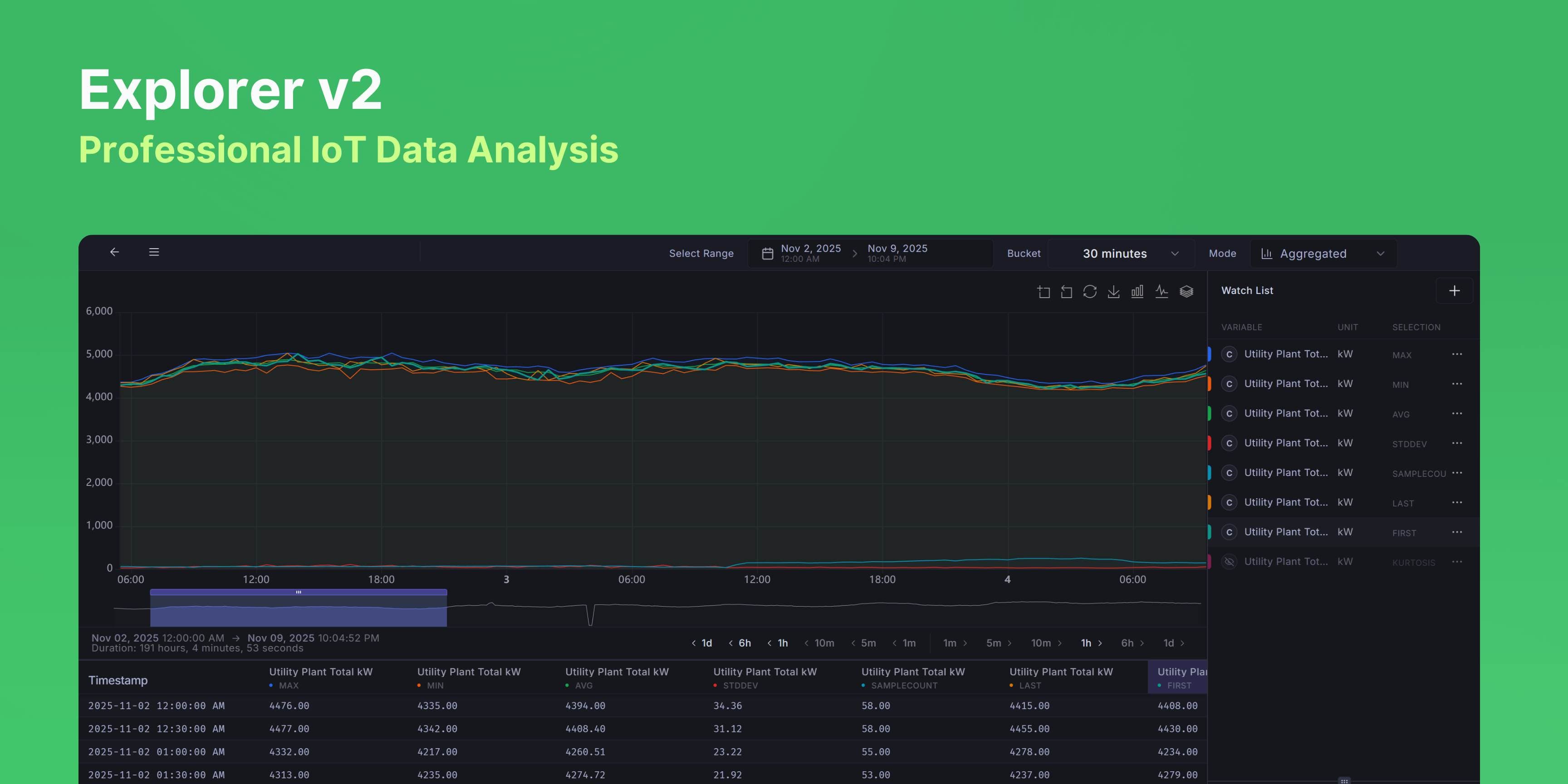
Explorer v2, Professional IoT Time-Series Data Analysis
Overview
Explorer v2 is a professional-grade time-series data visualization and analysis tool designed for IoT device monitoring and operations. It provides real-time and historical data exploration with advanced statistical analysis, intelligent time-range management, and high-performance rendering capable of handling 10,000+ data points smoothly.
What's New
Raw Mode — See unprocessed sensor data for the last hour. Great for troubleshooting recent issues or checking what's happening right now. Limited to 16 variables max to keep things fast.
Aggregated Mode — View statistical summaries over any time range. Add the same variable multiple times with different aggregations (MIN, MAX, AVG, etc.) to compare patterns. No variable limits.
In Aggregated Mode, you can view data as MIN, MAX, AVG, SUM, Standard Deviation, Sample Count, Kurtosis, First Value, or Last Value. Add the same sensor multiple times with different aggregations to see the full picture — like plotting MIN, MAX, and AVG of a temperature sensor together to see its range.
Buckets have range requirements (e.g., 1-hour buckets need at least 24 hours of data). When you pick an incompatible bucket, Explorer suggests three ways to fix your time range: extend/shrink the end date, extend/shrink the start date, or center and adjust both. Click any suggestion and it applies the fix, switches buckets, and refreshes your data.
Renders 10,000+ data points smoothly without lag. Panels resize by dragging, charts zoom and pan, and hovering table columns highlights the chart series. Time jump buttons let you skip forward/backward by preset intervals. Export to CSV with one click.
How people use it
For troubleshooting, switch to Raw Mode and look at the last hour of unprocessed data. For monthly reports, use Aggregated Mode with 1-day buckets and plot MIN, MAX, and AVG together to show daily ranges. To find problem devices, compare the Standard Deviation across multiple devices — high variability usually means something's wrong.
Coming soon
Alarm overlays on the timeline, annotations for specific time periods, and side-by-side time range comparison.